Monday, April 11, 2016

Writing for the Web

The purpose of this activity is to assure that the copy created for an online platform is approached in a cohesive fashion. By demonstrating sufficient knowledge when writing for the web, the viewer will be able to "skim" the copy while getting all the important information they need. 


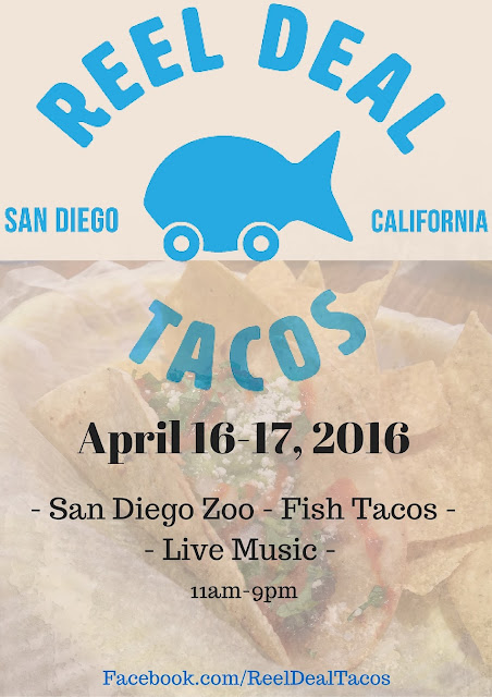
Reel Deal Tacos GRAND OPENING!

Last Friday, Reel Deal Tacos opened their doors to the public for the first time here in sunny San Diego, California! If you haven't had the chance to catch them at one of their locations, I highly recommend it. They begin each day down at the costal docks to stock up on fresh and organic ingredients. Fish tacos is their famous menu item, customers just can't get enough! This beautiful creation and much more can only be found wherever fresh ideas, ocean breezes, and sunshine are abundant! But in case you don't know where that's at, below is a list of Reel Deal Tacos daily locations and their hours of operation. 

Hours of Operation
EVERY DAY OF THE WEEK!
Lunch: 11am - 2pm Dinner: 5pm - 9pm

Rotating Schedule of Stops
The location of our food truck varies every day.

MONDAYS
Lunch: San Diego State University 
Dinner: UC San Diego 

TUESDAYS
Lunch: UC San Diego
Dinner: San Diego State University 

WEDNESDAYS
Lunch: San Diego State University 
Dinner: UC San Diego

THURSDAYS 
Lunch: UC San Diego
Dinner: San Diego State University 

FRIDAYS
Lunch: Hotel Del Cornado
Dinner: Downtown Gaslamp District

SATURDAYS AND SUNDAYS
Lunch: San Diego Zoo
Dinner: Special Events 


Thursday, April 7, 2016

Monday, April 4, 2016

Competitor Research


The purpose of this activity is to learn what content I want to include on my site and what I don't want. By researching and comparing multiple sites, I am able to get a steady background on what works and what doesn't. 
(website links are included at the end of the video)

Content Strategy

The purpose of this activity is to learn about the best practices for developing web content along with bringing forth what I learned about Content Strategy though this Lynda tutorial. I will also be reflecting on what I found most interesting, what I want to learn more about, and how I will apply the practices I learned to my fictitious scenario Reel Deal Tacos.

The three points of interest I have after reviewing the Lynda tutorial is defining the style, categorizing web content, and working with influencers. After watching this video, I learned that defining your style is extremely important. You must know the voice and tone of your client in order to begin this process. Categorizing is also very important but can also be fun. When you categorize, its important to think outside the box. Instead of sorting the content just by pre-conceived categories, you can also sort it by size, style, and shape. Don't be afraid to get creative! Lastly, I learned that there is no such thing as bad publicity. Take others criticism constructively. Use their responses and feedback to further improve your content. 
What topic I would like to know more about is content audit. I would like to learn more about this topic because it is still puzzling to me. I would like to further my knowledge on why this is an important role in content development. 
I will apply the insight gained from this lesson to my fictitious scenario by addressing all the strategies I learned, toward my project. I will organize my layouts and make a copy so that I can make it convenient and logical.  

Tuesday, December 15, 2015

DVA: RISE Peer Feedback


Review: Nance Cathleen DVE Fine Cut 

Reflect: 
What struck me about your video was how well the blur and the glitchy transitions looked from clip to clip. It looked really great and I thought that it fit your video very well. It makes me want to play around with the transitions more for my video. 

Inquire:
I noticed that only one of your clips was a different color filter. By doing this, did you mean to demonstrate that this was an important clip to you, or should I say, the most important clip in your video?

Suggest:
As far as quality goes with your clips, it is definitely very good. You might want to add warp stabilization to your clip at the 15 second mark in your video to make it smoother. I think that by adding this effect it will make it look less unsteady and overall add professionalism. 

Elevate:
Perhaps you can highlight certain clips with some color to make your overall video more enlightening and heartfelt if that was what your goal was. I remember you mentioning you wanted to show everyone what a great dad he is and I think by adding some warm tones, it will really bring it out more. In the end, I loved your credit slide. For some reason I didn't think about making my credits look like this and I definitely prefer this over how I made my credits. Great job overall! 


Sunday, May 3, 2015

Revised Portfolio Subject

Expedition Magazine 

This travel magazine called Expedition Magazine will provide users with information about places and landmarks to travel too. It will provide information about these places that include names of the landmarks, how they came to be, how to get to these landmarks, and surrounding places to travel too.  
Our main purpose for this magazine is to shine light on unknown places that most people would overlook. To provide knowledge to those who love to travel and help them document their own experiences traveling around the world. 
We have a commitment to proving readers with accurate information.
A commitment to using passionate images that will not only inform people, but make them aware of how beautiful our earth really is. 
A commitment to inspire every reader to travel to the ends of the world. 
A commitment to maintain an adventurous magazine that people will gain knowledge from. 
Our intended audience is directed to men and women who love to travel and learn knew things. Our customers would be geared toward photographers, travelers, teachers, students, and journalists. 
This magazine would have a logo of a compass rose. The associated color for this magazine would be forest green. 
Users will be able to document their experiences on our website and our blog; which leads me to our media needs. Expedition Magazine's greatest media needs would be social media sites, advertising on t.v., and also having our own website with more information not included in the magazine. 


AET_week4_project

Original Photos


Edited Photo


The visual hierarchy starts with the dominant object in this ad, which would be the bold title at the very top, along with the man sitting on the rocky ledge. These are the dominant images in this ad because they are the two most important objects to tell what this ad is about. Expedition in bold with the white background pops out immediately and tells the reader that this is going to be like a travel magazine. The man in the photo gives the reader a feeling of being content, accomplished, and happy.   With his dark blue jacket against the sunlight, this causes contrast with the background making him one of the first things that the viewer sees. The subdominant is the word magazine, the compass rose,  and the slogan, "Discover Your Happiness". I used a color that made them standout against the background, but they are not bright enough to be the first thing that you see. 

The color schemes that I used are complementary and split complementary colors. The main colors in the ad are oranges and blues. These colors fit best with this ad because it gives it more of an earthy tone, relaxing feel, but also making the viewer feel happy and content. The split complementary colors cause contract but with less tension, which is the main goal of this magazine ad. 

The overall emotional impression I was hoping to make with this ad is the feeling of warmth, accomplishment, and happiness that one gets when making new discoveries. There is nothing better than the feeling of seeing something you've never seen before. Between the colors and the scenery, this ad captures the moment of beauty that the earth holds; a moment where time stops and one can just enjoy the view. With this image of a man (my brother) sitting on a rock enjoying the sunset, one can only imagine the adventure he had to experience just to get there. This is why I had chosen to use the slogan, "Discover Your Happiness". With that, it tells the whole story about what this travel magazine is all about.