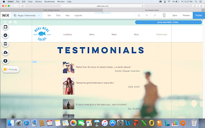
The purpose of this activity is to better understand what can be improved. By revising my website, I will be able to demonstrate the knowledge and concepts I have learned throughout this course.
Before:
After:
The first change I made to my website is the background. Originally, I had a plain blue color. It was very bland. Now that I have added a blurry image of the ocean and surfers, it really brings out the oceanic feel that the business wanted in the first place. This is displayed on all pages except the home page. The second change I made to my site was the alignment. All the text on my site was center aligned which can be unprofessional and hard on the eyes for viewers. On my News and Story tabs, I changed this to left and right aligned. I did, however, leave the center aligned on my menu page and locations page because I felt that those were an exception. Lastly, I had to change my layout of my text due to the change in alignment. When I changed the text to left and right alignment, I had to change the way the text was on my pages to make it more organized and easier to read.


No comments:
Post a Comment